Daybreak Roasting Co. Craft Food Branding / Hand Lettering
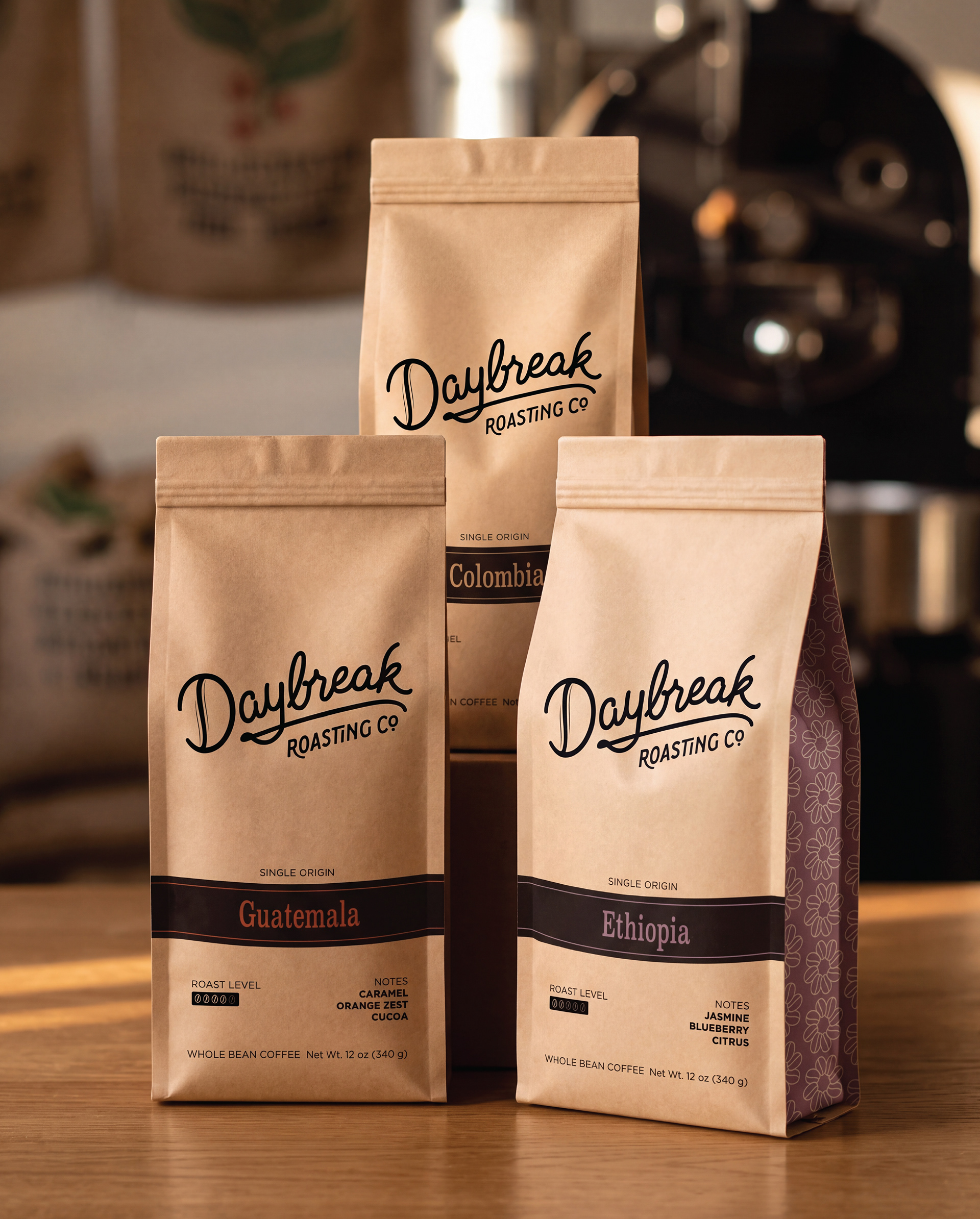
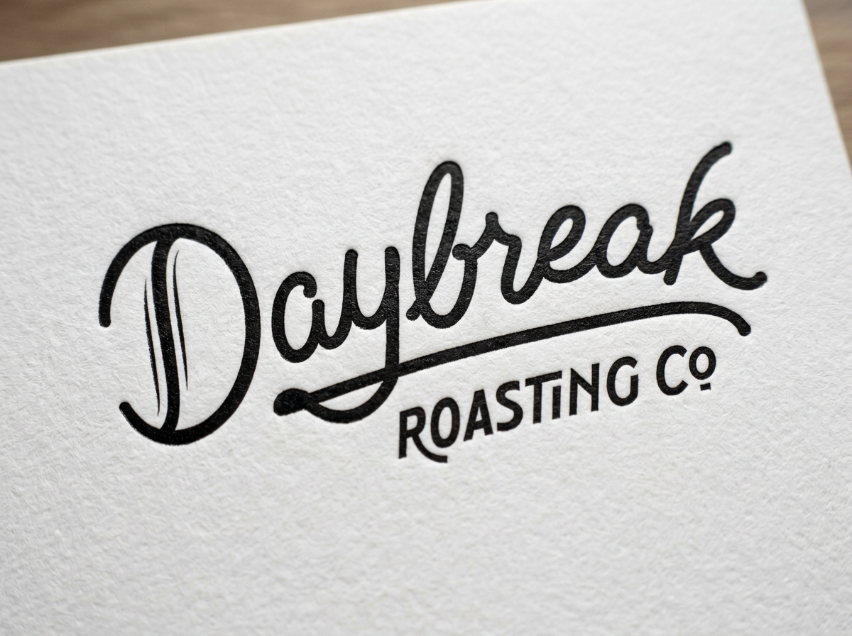
Daybreak Roasting Co. needed a wordmark that could hold its own in a market built on either rustic serif labels or stripped-down minimalist branding, without settling into either camp. The brief called for lettering that felt like the first pour of the morning: warm, unhurried, and personal, while still reading as a legitimate retail product across bags, wholesale cases, and future line extensions. A loose, confident script became the foundation, built with enough underlying structure to stay legible at small scale and enough looseness to avoid feeling stiff or corporate. A connecting flourish ties the wordmark into "Roasting Co." below it, unifying the two into one lockup rather than a name with a tagline stapled underneath.
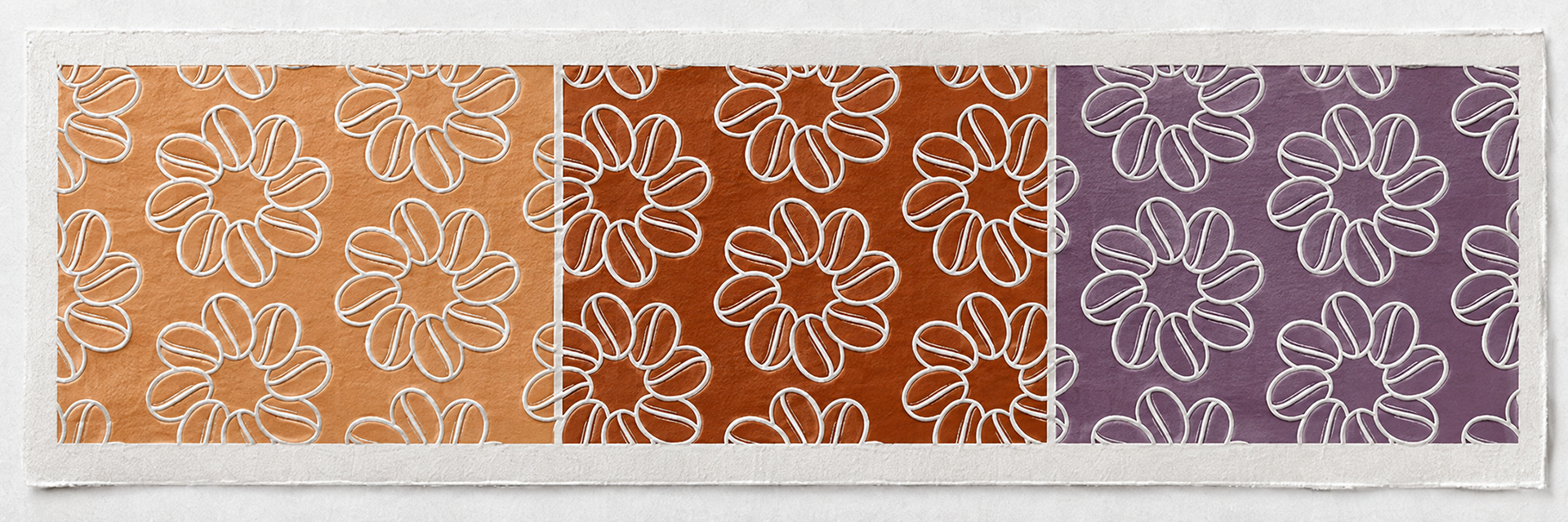
Look closely at the D. Can you find the bean? See it in the color-coded pattern?